The landing page is the “arc de triomphe” of any affiliate marketing campaign. It has to stand the test of time, yet engage visitors in a way that compels them to take action. Here are some tips on how to make a landing page like the pros and increase your conversion rate!
A landing page, if you don’t know, is a single-page website, or a page dedicated to a specific goal on your regular website. The purpose of the landing page is to capture a visitor’s information through a lead capture form – and in affiliate marketing, your landing page may also serve as a bridge page between a traffic source and an offer. The landing page will capture prospects’ contact info to grow your email list and increase the size of your customer base.
So, how do you make a landing page that will do all of this? It all comes down to sticking with the basics and avoiding the common mistakes that hold a lot of marketers back from success!
What a Landing Page Looks Like
Before we dive into some tips to make landing pages that convert, we should see a few examples of some actual landing pages in the wild.
The following are real-life landing pages that have performed well, along with a little bit of insight into what makes them work!
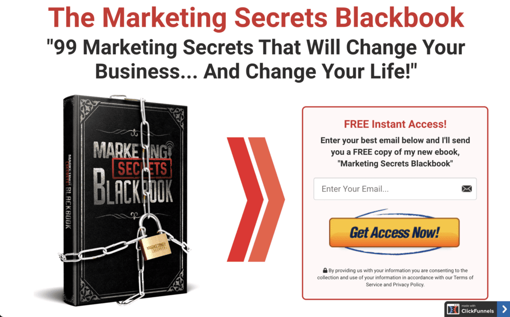
The Marketing Secrets Blackbook
First, let’s take a look at The Marketing Secrets Blackbook, a lead magnet from ClickFunnels. Right off the bat, the page hooks you with a headline that promises an explicit benefit: “You’ll change your business and your life with these marketing secrets.”

That’s important, but check out the incredible graphic of a blackbook that’s all locked up with a padlock and chains. This image REALLY makes you want to know those secrets, doesn’t it?
From the blackbook graphic, an arrow guides your eye over to the opt-in form, where there’s a prominent yellow button CTA. The whole thing is EASY to sign up for – and in this case, ClickFunnels has the data to back this up, with a conversion of more than 70% on this landing page!
All of this is above the fold. You can’t see it in the screenshot, but the page goes on to provide some additional bullet points about what the blackbook actually contains. But the key takeaway is, you don’t need to scroll at all to sign up.
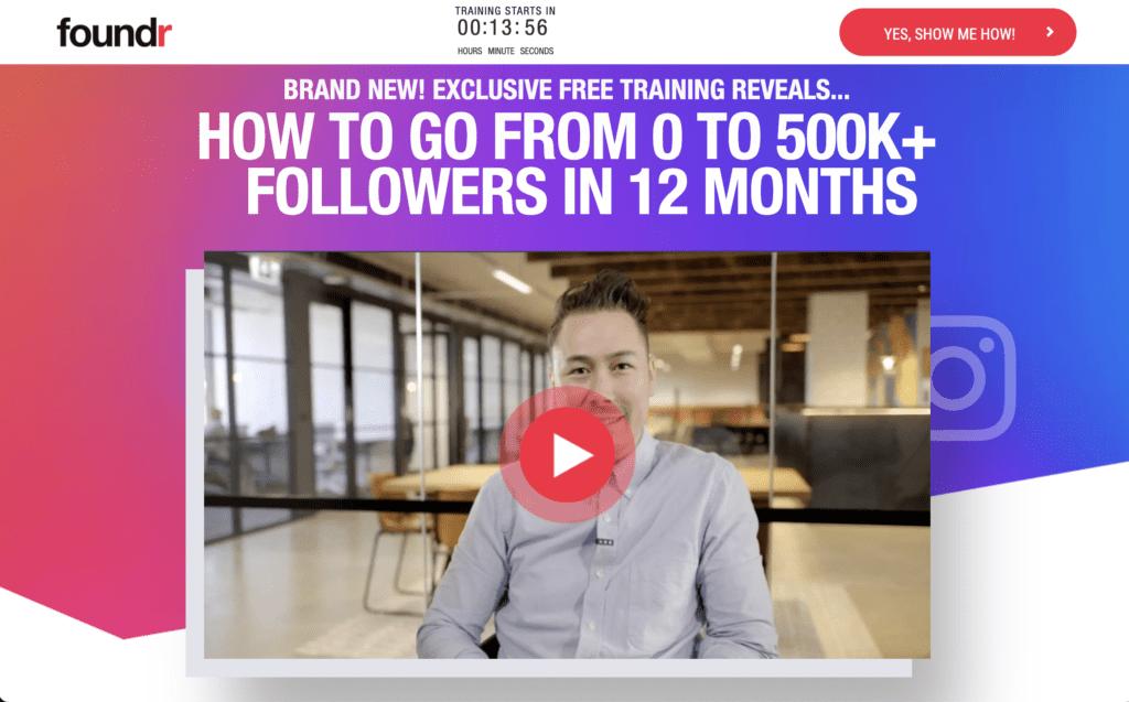
The Foundr Instagram Masterclass Training
Our other landing page is an Instagram Masterclass from a brand called Foundr. What can we learn from this one?

Well, there’s another bold headline with a specific benefit. As a visitor, if you’re at all interested in growing your Instagram following, then you’ll be intrigued by the promise of 500K followers in the next 12 months.
A few other interesting differences are the addition of a 15 minute countdown timer that suggests you could miss the training if you don’t sign up soon. It also features a very flashy red button in the top right to get subscribers right there above the fold.
Of course, the other major difference is the inclusion of a promotional video. This makes sense for a landing page that leads to a video course, as this one does – but it’s more than just about keeping the format consistent.
The video does a few key things:
- It communicates professional quality thanks to incredible video production values
- It creates a greater bond between the viewer and an actual person behind the brand (in this case, the CEO of Foundr)
- It uses social proof from the likes of Richard Branson and Gary Vee, as well as examples of Instagram successes they’ve had
Like the first landing page example, you have all the information you need above the fold to sign up – no scrolling needed! However, if you choose to scroll, you’ll learn more about what’s included in the video, see more social proof, and of course, discover testimonials of fellow students who saw success with this class.
On the whole, these landing pages show you how important first impressions are. You may have to sell some people a little longer, but you want the page above the fold to ideally be enough for the majority of visitors to sign up or take the desired action.
Ready to build a landing page for yourself now? Check out these 10 tips on making a landing page!
1) Try Out Multiple Landing Pages
This might sound like a lot of work right out the gate, but stick with me. Having multiple landing pages each containing content tailored to a specific audience creates a larger net to bring in more subscribers. It also allows for split testing different pages side-by-side to see what works, making it possible to double down on the highest convert pages!
The best way to try out multiple landing pages is to invest in the right tools to make the job easier. I suggest Convertri for ease and experience.
2) Keep Landing Page Navigation Simple
A landing page is not the place to try out anything new or out of the ordinary when it comes to navigation experience. You need to remove any irrelevant content and make sure all of the content is visible of the screen before the user scrolls below the fold.
The most important thing, however, is that you make a landing page that seamlessly guides visitors to take an action. The user should NEVER have to guess where to click next to buy, subscribe, or get more information. Follow UX best practices to ensure that you’re setting yourself up for success!
3) Choose a Respectable Typography
Typography is a way to grow trust. Conversely, it can also be a way to break trust. So, it makes sense that you put some care into choosing a typeface for your landing page.
In almost all cases, I recommend sticking to the classics. Helvetica and Arial are universal fonts that convey trustworthiness. Most importantly, sans-serif fonts like these are unassuming, so you aren’t distracting anyone from your message or CTA with a font that’s calling too much attention to itself!
4) Use Your Power Words
Power words are words that your readers can relate to. They typically trigger an emotion and compel an action. Here are some power words that you might know:
- Unforgettable
- Embarrassing
- Forbidden
- Trick
- Secret
Utilizing these words in your copy can engage the reader engaged and “hook” them into your offer. Find more helpful power words here.
5) Create Scannable Copy for Your Landing Page
Scannable copy allows for readers to easily get the gist of your page. Bullet points and lists can help break up chunks of text, and varying font sizes between headers and paragraph bodies can help indicate to the reader the most important parts of the page’s message.
However, don’t rely too heavily on these elements to keep your reader engaged. The most important thing is to make sure your copy is good before you ever worry about making it scanner-friendly!
6) Optimize for SEO
It’s important to improve the chances someone finds your landing page by optimizing it for search engines. You want your landing page to show up in the SERPs, so you need to use relevant keywords on the page itself, in the URL, in the headlines, and in the image alt attributes. These little steps will indicate to search engines what your page is about and who should see it in the search results.
This doesn’t mean Google will be the primary way you get traffic to your landing page, but it’s still a good practice to maximize the chances of success. For example, if people hear about your free “Marketing Secrets Blackbook” and search Google looking for it, you’d definitely want them to be able to find your actual page!
7) Make Responsive Landing Pages for Phones
A big chunk of your visitors will come to your site via their smartphone. So, you need to make sure that your landing page looks good and is easy to navigate for mobile.
Optimizing for mobile also conveys that you are trustworthy and professional. Imagine all the potential conversions you’re missing out on if your mobile site isn’t dialed in!
8) Add Share Buttons
This one is optional, but can be valuable depending on your type of niche and content. Share buttons will obviously help visitors share your page to their social media and to their friends and family who might also be interested in what you’re promoting.
If you have a specific action you want people to take, unnecessary share buttons could distract from this – but for more viral or shareable content, this may be the perfect way to get more traction for your landing page without spending a lot of extra time or money. Landing page builders often have social share buttons as a built-in option.
9) Put the CTA Above the Fold
What do you want people to do when they get to your landing page? Whatever that step is, you need to create a clear and specific call to action (CTA) and put it above the fold on the landing page.
“Above the fold” refers to the screen view before a user has to scroll to see more. This is helpful for visitors who are already primed to take the desired action. In both of our earlier examples, it was easy to find a CTA button immediately – no scrolling required at all!
10) Find Some Helpful Tools
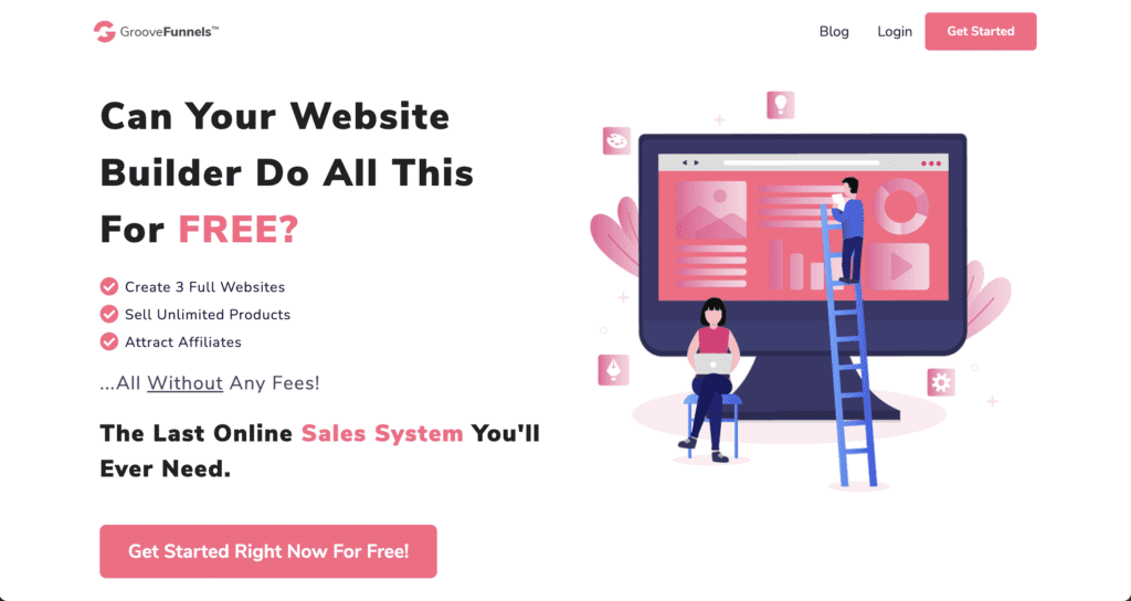
There are oodles of landing page tools out there that can help you optimize, streamline, and make a landing page like the pros. I recommend the Groove Funnels tool. The basic version is free and it will help you build an email list, create a funnel, and much more.

Other good options are Convertri or ClickFunnels as a funnel builder, or a landing page builder like Leadpages or Unbounce. If you’re on WordPress, you should also check out a theme like Divi or Thrive Themes with built-in page builders.
Last but not least, make sure you have some tools to track your affiliate marketing metrics. Software like Leadpages will have metrics built-in, but if you’re going with pages on your own website, set up Google Analytics with events so you can measure how your landing page is performing. These numbers will guide you in optimizing your page for better conversions.
Make a Landing Page Wrap-up
Hopefully, these landing page examples and tips are helpful for you!
Just remember that while a landing page is only one piece of your funnel, it’s arguably one of the most important. The landing page is that final stage before you start making money, so it’s worth doing right – including design, copy, and layout/UX.
Keep these tips in mind when you go to make a landing page and you’ll be headed in the right direction!
Want more help? If you’re itching to get up to speed on building landing pages and entire funnels, check out Spark by ClickBank and our brand-new Funnel Workshop course from ClickBank’s long-time business development manager, Kyle Kostechka!
In the meantime, best of luck on your next landing page!


