


Making sure your ecommerce website is mobile friendly is one of the best things you can do to boost conversions. People buy on their phones. So make sure they can buy from YOU.
Our society is ruled by smartphones—their convenience and efficiency has made them an essential part of day to day life. As smart phones have become…smarter, they have ultimately replaced the need for watches, calculators, snail mail, calendars, newspapers, weathermen, radios, personal assistants…and the list goes on. So it’s no surprise that shopping has quickly gone the way of mobile. You can book a hotel, flight and rental car all while waiting in line for your coffee. You can order some new shoes while walking to work. Or, you can send your wife flowers while you’re taking the elevator. Mobile accessibility makes online shopping just that much easier for customers (and that much is enough to finalize a purchase).
What does Mobile Friendly mean?
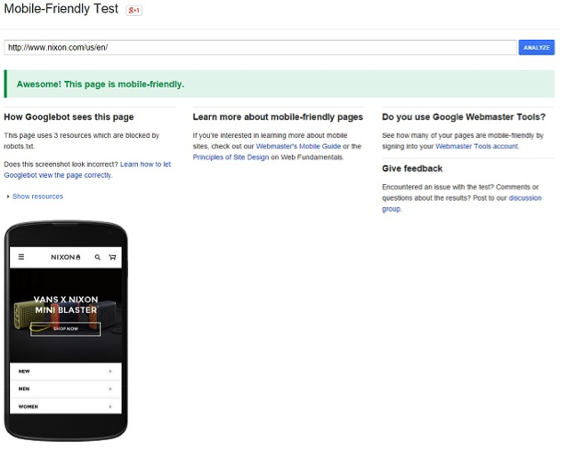
Determining whether or not your eCommerce site is mobile friendly seems like a simple enough task—plug in the URL to your smartphone and check it out. Is it easy to navigate? Are the images in tact? Do the buttons function properly? These questions are fairly intuitive, but they are only half of the equation. No matter how slick your website looks from a smartphone, its true mobile friendliness will be decided by the all mighty internet fortress—Google.
As of April 21st, 2015, Google now uses mobile friendliness as part of its ranking algorithm and in turn places mobile friendly sites at the top of the search results. While other factors including location and browsing habits are part of the algorithm, without a mobile friendly website it’s nearly impossible to land yourself on the first page of Google results. Google has made an easy to use Mobile-Friendly Test that allows you to plug in your URL and see whether your site passes the test. If not, Google will guide you on changes you can make to meet their criteria.
If you want more information on Google’s mobile algorithm update check out our blog post on everything that changed during the update.
How to be a Good (Mobile) Friend
If you don’t pass Google’s friendliness test, you will be left with two options: You can create a mobile subdomain or you can create an app. For most eCommerce sites, creating a subdomain will solve all of your mobile woes and will be a fairly easy fix. Essentially it will generate a mobile specific version of your site that smartphone users will be guided to, while desktop users will still be able to view your full website.
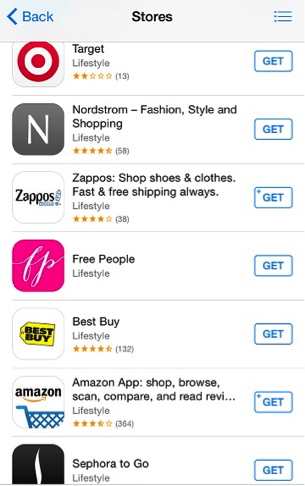
For online vendors with lots or returning customers and impulse buyers, an app might be the better route. While apps are a larger investment of resources to create, they can pay off big time with repeat customers that love the ease of being able to open an app and shop. Keep in mind that most customers won’t go through the trouble of downloading an app for the initial purchase, and thus apps should be used by vendors that already have a strong base of returning customers.
No matter what you are selling, rest assured that your customers are smartphone users. Making your eCommerce site mobile friendly not only makes it easier for existing customers to make a purchase, but it makes you available to new customers. In a world where everything is at our fingertips, you better make sure your website is just a click away.